
Window 7
Inbox content, visual definition, brand structure and guidelines for the Windows 7 release.
The Design Approach for Windows 7
Windows 7 was a major release of the Microsoft Windows operating system, providing enhanced user experience and improved performance over its predecessor, Windows Vista. With the design approach for Windows 7, Microsoft aimed to create a more intuitive and visually appealing interface inspired by light and energy, while also focusing on efficiency and user productivity.
Aero Visual Style
The centerpiece of Windows 7's design approach was the introduction of the Aero visual style. This new interface brought a sleek and polished appearance to the operating system, with transparent window borders, subtle animations, and smooth transitions. Aero aimed to create a visually appealing experience while maintaining a balance between aesthetic appeal and system performance. Attention was paid to all visual details, ensuring that the overall aesthetics were consistent across various elements, such as the taskbar, start menu, and window frames. The use of glass-like effects and transparency gave the interface a modern and sophisticated look. Adherence to Accessibility guidelines became mandatory for release.
Improved Taskbar
Windows 7 brought significant changes to the taskbar, which greatly enhanced user productivity. The new taskbar featured larger icons with improved visuals, offering a more intuitive way to interact with running applications. Commonly used applications could be "pinned" to the taskbar, allowing users to quickly access their favorite programs with just a single click.
Additionally, Windows 7 introduced the concept of "Jump Lists" in the taskbar. These context-sensitive menus provided quick access to frequently performed tasks or recent files within an application, reducing the need to dig through menus or search for documents.
Libraries and Homegroup
To organize and access files more efficiently, Windows 7 introduced Libraries. Libraries allowed users to consolidate files from various locations into a single virtual folder, providing easy access to documents, images, music, and videos. This design choice aimed to simplify file management and reduce clutter, making it easier for users to find and work with their files.
Moreover, Windows 7 introduced Homegroup, a feature that simplified file sharing and networking within a local network. Homegroup allowed users to seamlessly share files, printers, and media with other Windows 7 devices, promoting collaboration and easy access to shared resources.
User Feedback and Iterative Design
Ww actively sought user feedback during the development of Windows 7, allowing the addressing of issues including the taskbar, start menu and general visual direction to improve the user experience. This iterative design approach ensured that Windows 7 addressed many of the concerns raised by users of its predecessor, Windows Vista.
BETA FISH AND SPLASH SCREEN CREATION
Project Overview and Goals
To bring a fresh start to the Windows operating system, the we sought a visually appealing and memorable logo. Inspiration struck the team when they realized the potential of a fish as a representative symbol. Fish, known for their agility and adaptability, mirrored the desired characteristics of Windows 7.
With this idea in mind, the design team embarked on a journey to create an iconic fish that would capture the essence of the new operating system.
Challenges
The fish would be the first representation of the operating system after the mixed reviews of Vista, creating an expectation of the release to come.
My role
Simply, my role was the update the background to change from the feel of an Aurora and to illustrate and create the Beta fish to be used as a symbol of the new release.
Previous screens for Inspiration
Shown below, the previous Vista had a feeling of being underwater.

Windows Vista Splash Screen

Underwater Depicting the Light rays
FInal WIndows Beta Splash Screen
To play off of the submerged feeling, I took the existing aurora bands and inverted them to mimic the look and feel of an underwater scene. Adding in directional diffused light added to the energy and feel of moving upward.

FInal Beta Fish Illustration
Using a Beta fish as a both a play on the release name, but also the direction of the product, I started with numerous pencil drawings of different beta fish. My entire office was was covered in sketches of the fish in different visual states. Some versions had the fish in the shape of a 7, a few versions that were cartoony, but I ended up with the more realistic fish shown below. Seven bubbles were added for the release number, with light and sheen added to speak to the goal of light and energy.

Illustration, Britt Hansing
Takeaway
The beta fish was well received and let to many stories on how it was created and the thought behind it. Much of the feedback did mention the idea of fluidity, speed, and light that aligned to our goals. The fish is named Bubbles.
Window 7 Release Splash Screen and Branding

Image of NYLON Magazine by Chuck Anderson of NoPattern Studio
In order to create the release version of the splash screen, we went through multiple mockups showing the concept of light and energy. The logo uses the standard quadrant base of the Windows Flag: red represents PowerPoint or the Office suite, blue for Word or Windows, green for the Xbox or Excel, and the yellow square for Outlook or Bing. After searching through several portfolios of people with skillsets of optimizing the use of light and energy, we landed with the extremely talented Chuck Anderson. He took the concepts I drew and created the final direction with direction from myself and my lead.
About Chuck
NoPattern Studio is the creative practice of artist & designer Chuck Anderson (b.1985). Established in 2004 at the age of 18, Chuck’s work has been sought after for nearly 20 years by brands & collectors worldwide. His work is acclaimed for its use of surreal color and light, innovative juxtapositions of traditional and digital mediums, and endless experimentation within his own art practice as well as his client collaborations.
Evolution of the FlaG
my role
I was in the running to create the final Windows flag, but we ended up going with Chuck Anderson for the final execution. My explorations were used as a base and Chuck ran with created the final version. Myself and my lead art directed and drove the process to completion.


CHallenges
Some of the original ideas were to have each of the quadrants represent an individual theme. We wanted an organic feel with the light and energy, but not a design that overwhelmed the logo itself. It was complicated to hit the sweet spot that kept it light and and airy.
Final Version

Final Illustration by Chuck Anderson of No Pattern. Concept Illustration and Art Diction: Britt Hansing and Denise Trabona

Packaging

Lock Screen
takeaway
The release version had very positive reviews of both the concept and the execution. The packaging was updated in structure and the updated look and feel supported the goals of the release message.
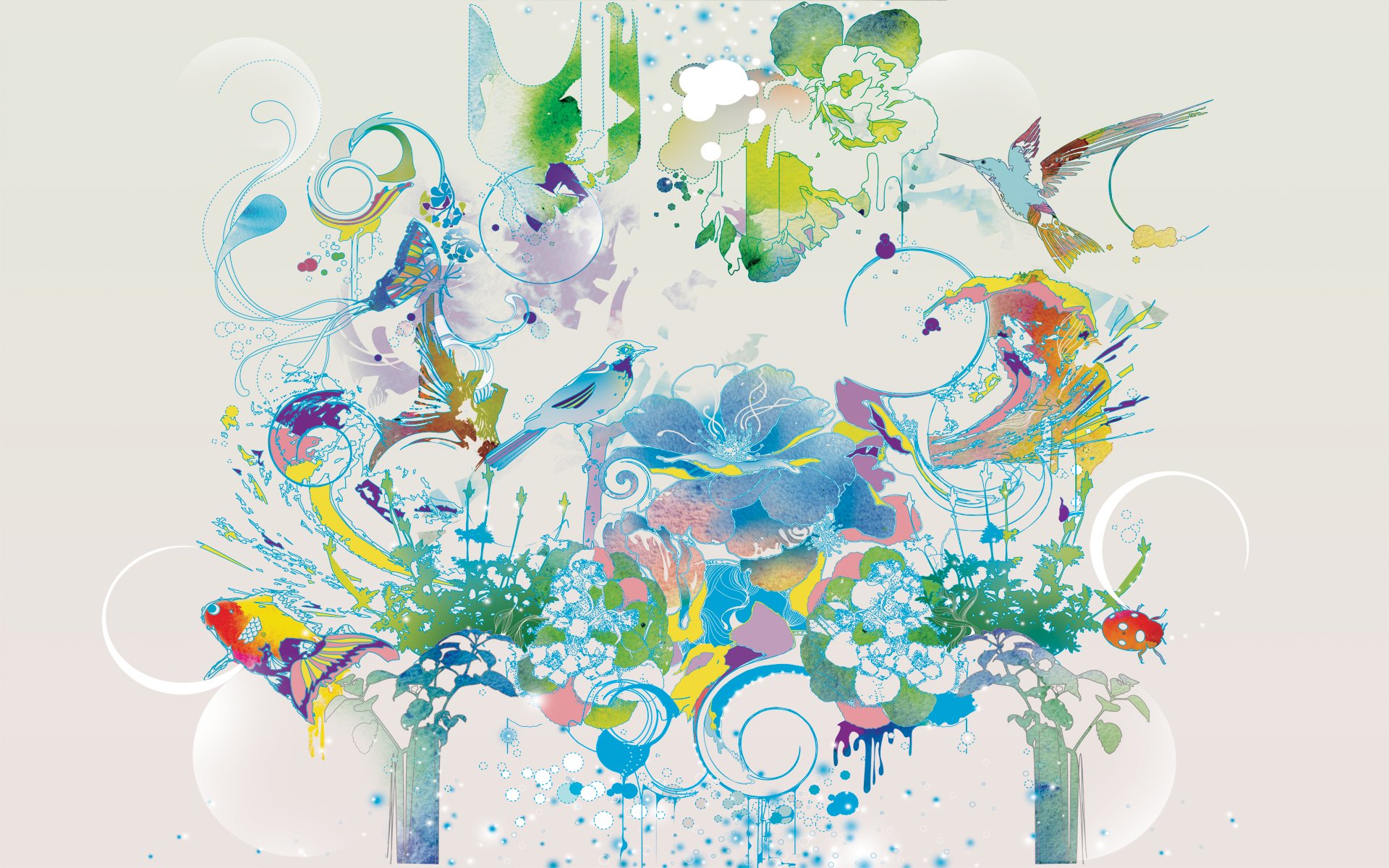
Inbox Content

Selection panel of all Inbox content for the Windows 7 Release
The inbox content was a process of selecting through hundreds of photos and reviewing several different illustrators. We worked directly with GEOPOL and Legal to obtain, purchase, and validate the final sets. For the US release, all photos were retouched by me, removing unwanted parts or elements that may not pass our GEOPOL standards. Photography was also chosen for all other country SKUs with consideration for each set of legal standards.
Illustrations remained untouched to keep the integrity of the design ranging from whimsical to photo-realistic and abstract. Our focus was bright, rich colors that would be eye-catching but something that a user could live with for a period of time. This was a collaboration with our Brand Team and 72 and Sunny.
My Role
Working with the Media Acquisitions Team, 72 and Sunny, Geopol, and Legal. We acquired the illustrations and photos to be used for inbox content. Additional photo retouching, cropping, and sizing for devices was executed by me for the US release. For international releases, I was tasked to work with the above mentioned teams to select photos with consideration for legal and political considerations.


Start Menus with updated glass frost
START MENU AND UPDATED GLASS
Windows 7 allowed the user to change the traditional blue colors to other personalized versions. The transparencies were created so that the user could see the desktop content through the framework, but also adjust the opacity of the glass to a desired level making content the key focus.